20 Cases of Effective Landing Page Design

If someone experiencing your online store for the first time sees a confusing or poorly designed landing page, they are unlikely to return. 94% of first impressions are related to design , and if someone doesn’t like what they see in the first 14 milliseconds, they are likely to leave your page forever. That means you are wasting money trying to attract attention to your product, and when those potential customers are all gone, you have to start all over again.
In fact, even the world’s biggest brands often have ineffective landing page designs. This is a common problem, but can be solved with a website design based on a deep understanding of your target audience.
Now learn from the experts how to create better landing page designs that convert prospects into actual customers, and check out 20 examples from successful brands to get inspired.
Great landing page?
Landing pages generally follow the same structure, but high-performing ones have certain elements that they pay particular attention to.
Content visible without scrolling
The 'fold' is the space that is visible on a web page without scrolling. This space varies depending on the device you are using, and the screen size varies depending on the model of each device, such as desktop, tablet, or mobile device. The 'fold' is generally about 600 pixels from the top of the browser window.
Not all landing page visitors will scroll beyond the fold on a desktop or mobile device. In fact, most site visitors likely won’t scroll at all.
Therefore, rather than designing only for the top and bottom of the page, it is important to focus on the flow of all the information that the user can see on the landing page without scrolling. This will ensure that important information and engaging elements are immediately visible to the visitor.
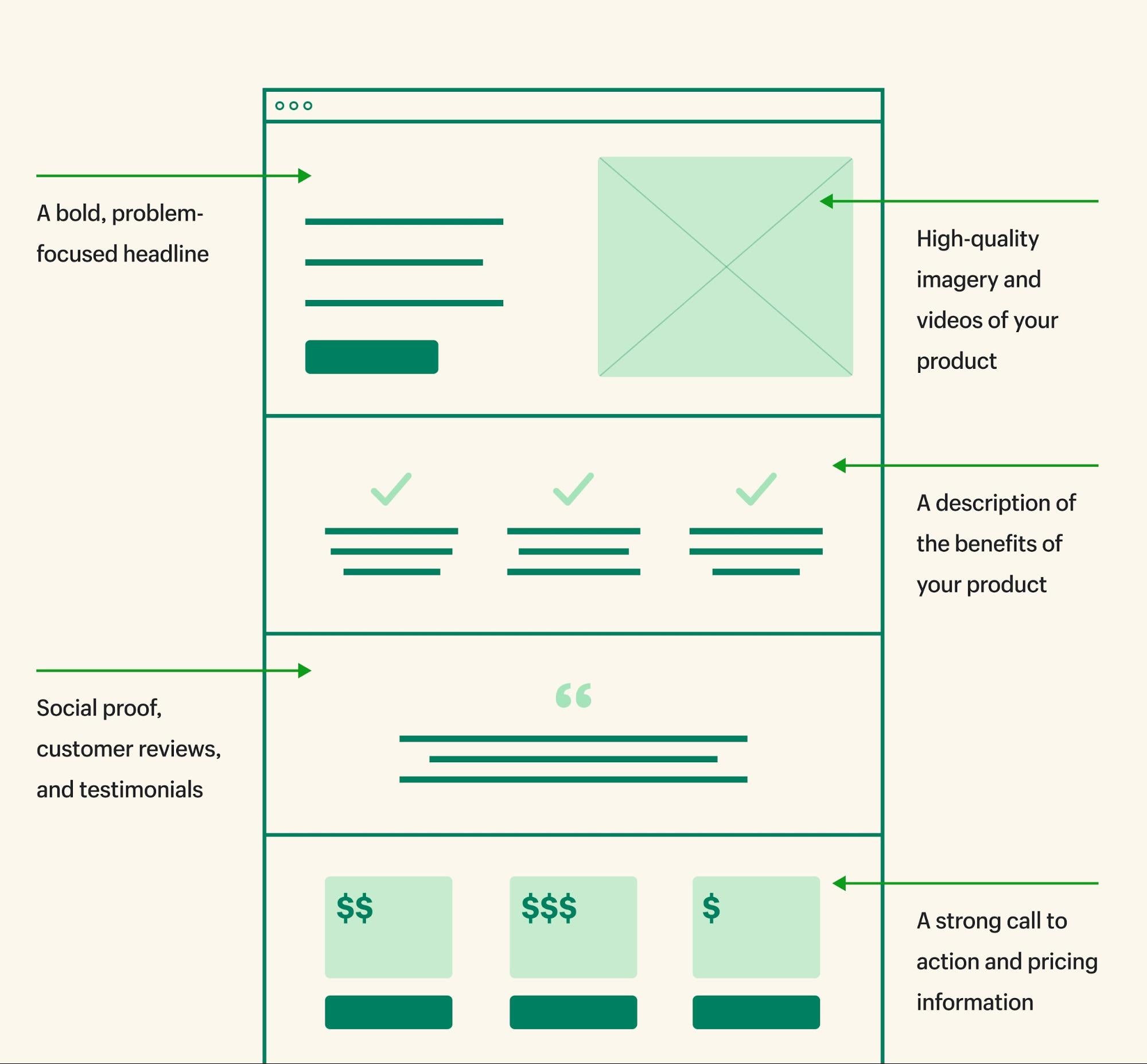
Landing Page Copy
A good landing page copy consists of the text on the page, the product description, the call to action (CTA), the headline, the meta title, and the description. When starting your landing page, it’s a good idea to use a strong, problem-focused headline. When writing your landing page copy, consider the voice of your customers. Find out what words and phrases your customers use through reviews and social media, and incorporate them into your landing page copy.
Don’t forget to emphasize benefits over features. For example, if your landing page is promoting a waterproof phone case, explain that you can take photos while swimming when highlighting the IP waterproof rating. Finally, compelling copy is written with your brand’s voice in mind. It’s important to be consistent across your targeted promotions and campaigns.
Image and color composition
Landing page design should consider colors and fonts, and make room for appropriately placed images. Many people write their landing page copy first, then develop their visual assets to ensure synergy between the two elements. Remember, images can include illustrations and videos in addition to product photos.
Customer Reviews
Ezra Firestone, founder of Smart Marketer and co-founder and CEO of BOOM! by Cindy Joseph, made a small but highly effective change to his Shopify store: adding customer testimonials instead of product names at the top of the buy box.
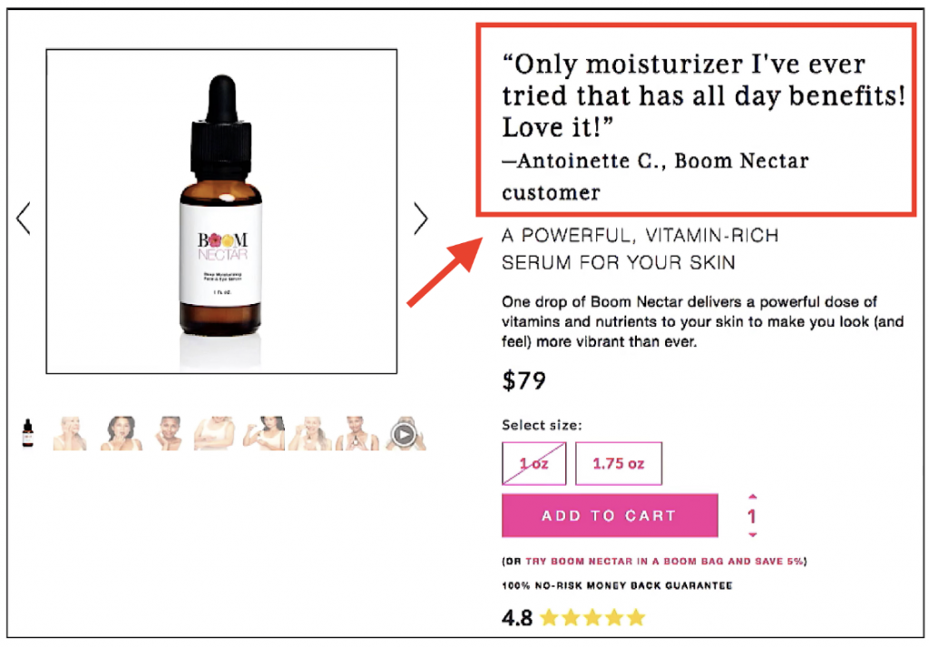
Including quotes at the top builds trust, keeps people from having to search for reviews, and lets your customers speak for themselves. However, it’s important to choose quotes that directly address the benefits or commonalities that each product solves.
Also, consider dedicating an entire section to customer reviews. This will allow shoppers to read the perspectives of people who actually bought your product. Be sure to include at least a few negative reviews and mid-rated reviews so that others can understand both the love and dissatisfaction with your product.
Call to action phrase
Every landing page needs an effective call to action (CTA). The CTA should encourage the user to take the desired action. Depending on the landing page, the CTA could be something like “Learn more,” “Buy now,” or “Subscribe.” If relevant, you can also include pricing information here.
If you are wondering where to place your CTA, it depends on your customer’s needs. You will decide based on your location testing to see where you are getting better conversions. Generally speaking, it is recommended to place your CTA in the pre-fold area and throughout the entire landing page, depending on the length of the page.
Landing Page Design Example
Brightland
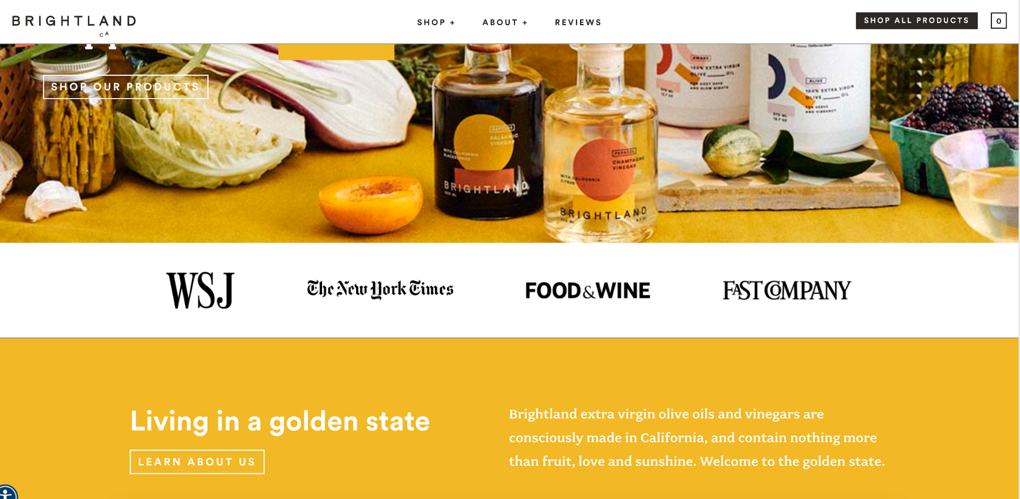
Have you been featured in a news publication? Nik Sharma, CEO of Sharma Brands, calls it a “Brag Bar” when your logo is featured on a landing page with a quote from the article. These publications add credibility to your brand, and a mention of them can be a huge help to shoppers looking for more information.
For example, Brightland sells California-grown extra virgin olive oil. The company has received positive reviews from publications like the New York Times and the Wall Street Journal, and uses this to its advantage in its landing page design.
Olipop
Olipop sells a healthier soda filled with plant-based ingredients and prebiotics to support a healthy microbiome. The brand uses benefit-focused copy to directly address consumer objections (e.g., “But how much sugar is in this soda?”), positioning itself as a craving-relief drink for die-hard soda drinkers looking to cut back on soda.
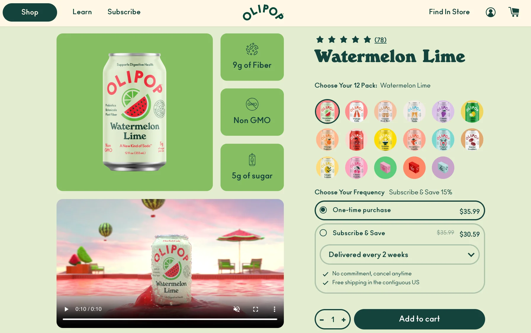
You can mimic other landing page ideas like clear, bold text, in-depth product information that can be seen through the scroll, star ratings that show the number of actual reviews to build trust, a small header that doesn't overwhelm the page, an intuitive, easy-to-navigate layout, and great product photos.
Path
Path is a virtual photo editing studio that runs Shopify stores. The company’s core service is product photo editing. Path uses email as one of several channels to market and communicate with potential customers, and has a dedicated landing page to drive subscriptions to their email newsletter.
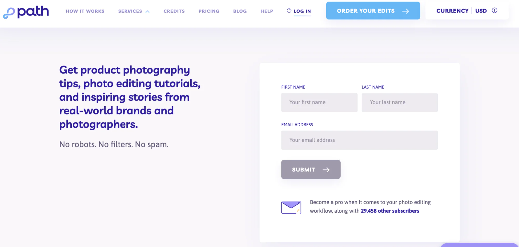
This page is clearly focused on the goal of driving subscriptions and minimizes distractions from that goal. The page is not located in an easily accessible location on the company website, but you can drive traffic to this landing page through a targeted campaign promoting newsletter signups.
LUSH Cosmetics
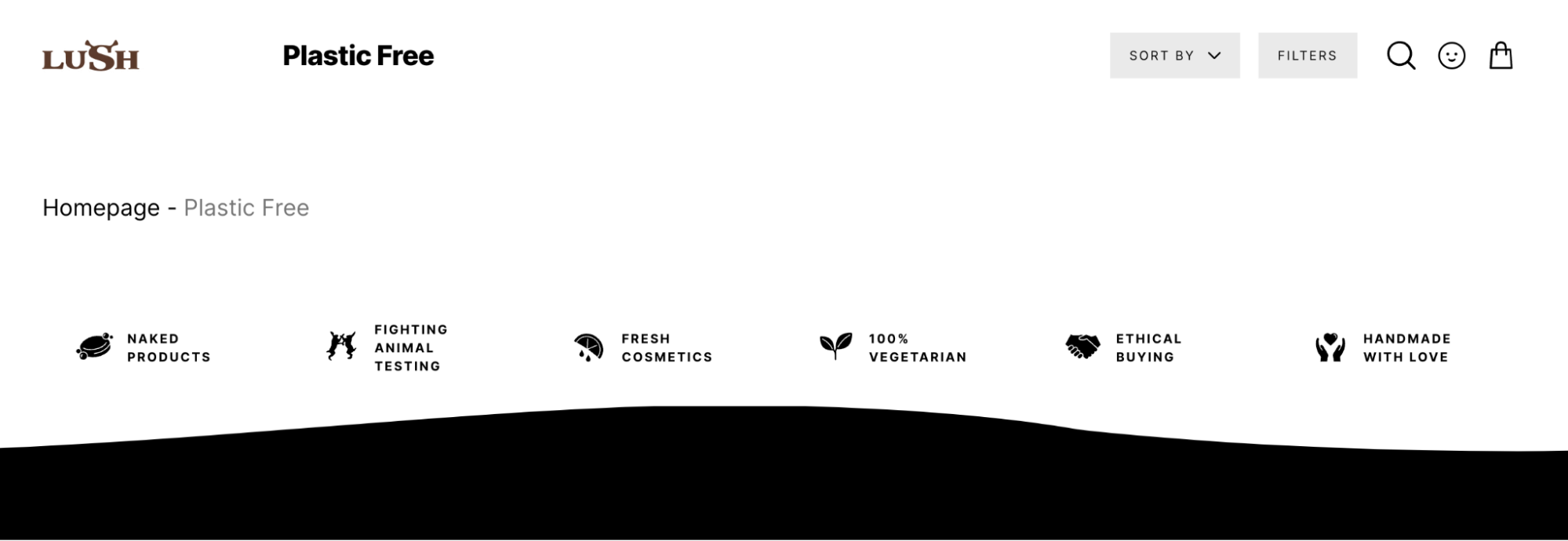
Certifications can give your customers a lot of confidence, and some customers won’t buy from you without them. Examples include Leaping Bunny, Non-GMO, or B Corp certification. If your brand has any certifications, it’s a good idea to display them on your landing page.
LUSH Cosmetics took this approach to designing their landing page. At the bottom of the “ Plastic Free” page, you can see the brand’s core values, which include that their products are 100% vegan, handmade, and not tested on animals.
Netflix
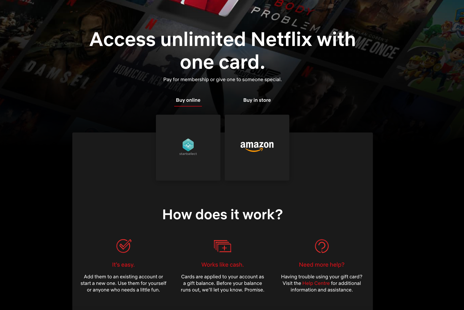
Netflix is considered a pioneer in the subscription industry. With over 260 million paid subscribers in over 190 countries around the world, it has a wealth of know-how in designing landing pages that persuade people to subscribe.
For example, if you look at Netflix’s gift card landing page design, it has two simple calls to action (buy the card from Netflix or buy it from Amazon) and a short description of how to use the gift card. The page is short and concise, and provides all the information a customer needs to know before making a purchase.
Grind
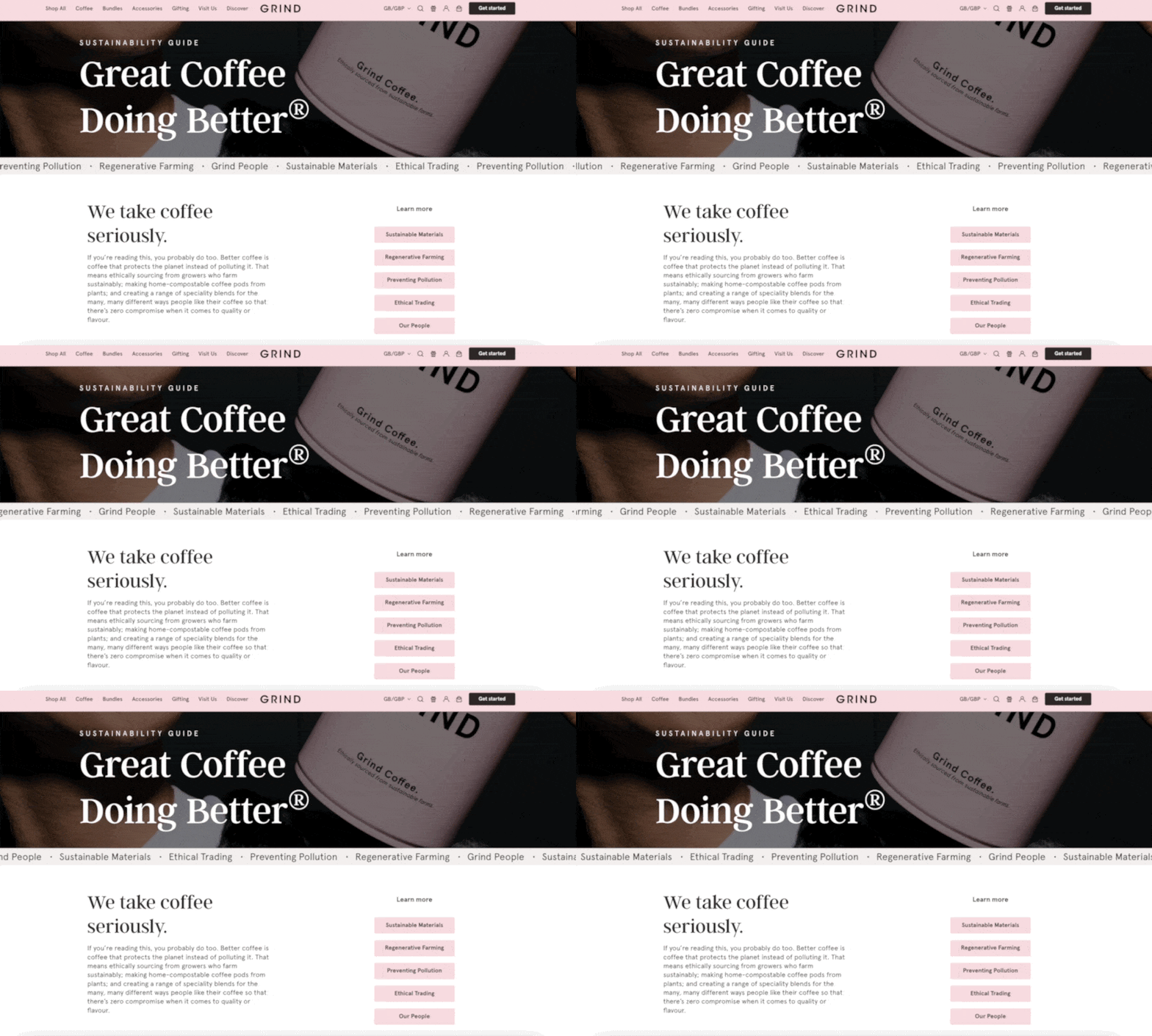
Grind is a coffee brand that sells through online stores and coffee houses. The brand talks about sustainability on their landing page, which is one of Grind's core values and differentiators.
What’s particularly notable about this landing page design is the use of visual elements: the scrollbar is positioned just above the fold, there are color-coded buttons to help people easily navigate to the sections they’re most interested in, and there’s an attractive subheading that speaks directly to the target market’s vocabulary, such as “We take coffee seriously.”
Creatorpreneur Academy
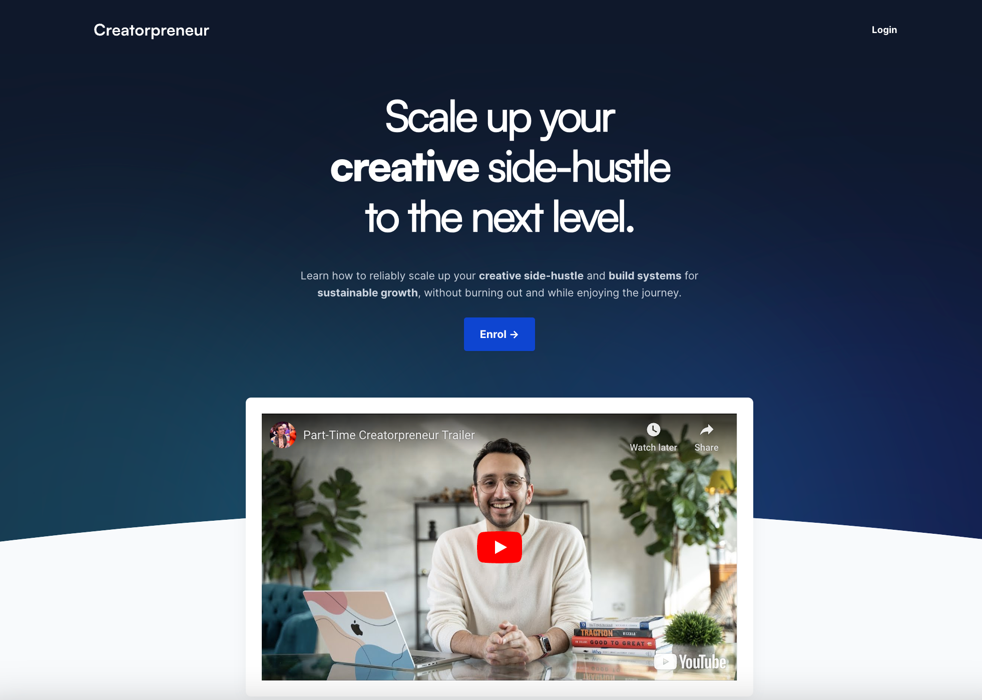
Digital products can be expensive, and consumers need a lot of information before making a big purchase. Creator Ali Abdaal designed the perfect landing page to meet this need, providing the information they need to know without overwhelming the visitor.
The first thing you see when you visit this landing page is the headline, “Take your creative side hustle to the next level.” This is a challenge and goal that resonates with the target audience. If you’d like to learn more without reading the text, there’s also a link to a YouTube video that explains the details.
Jolie
The main goal of a landing page is to encourage visitors to take a specific action. In the case of ecommerce, that action does not necessarily have to consist solely of information about the features or benefits of a product.
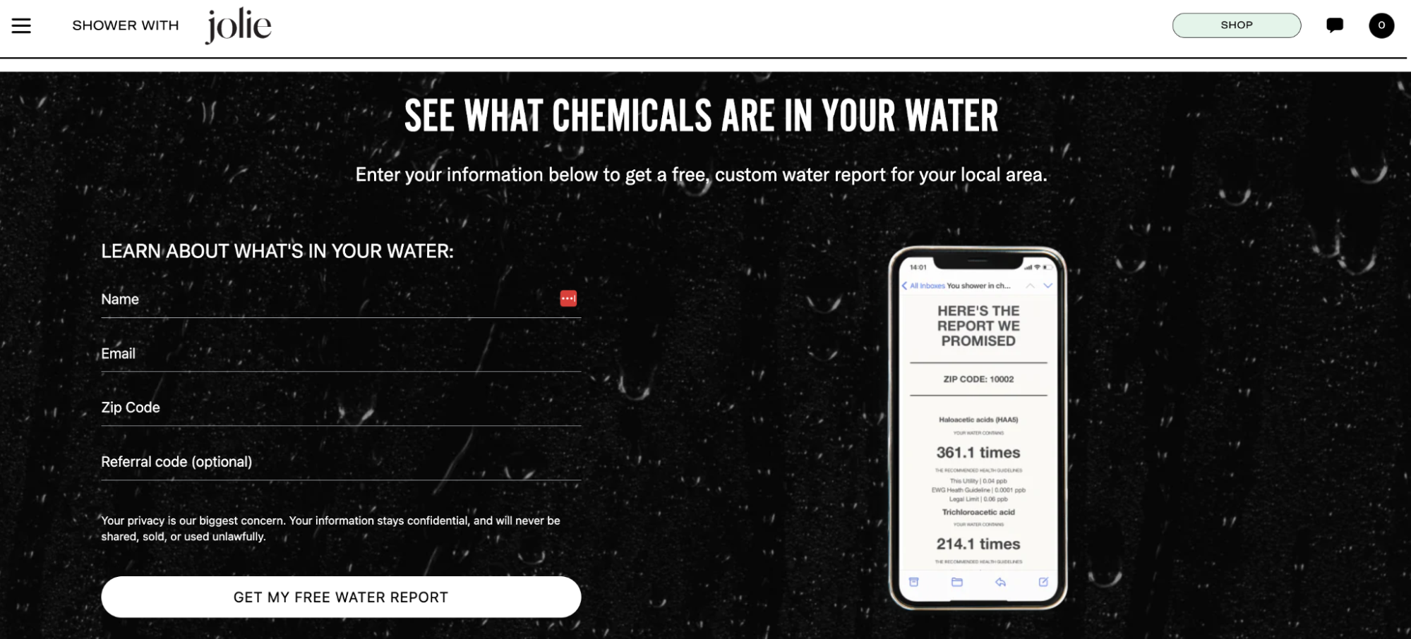
For example, Jolie, a direct-to-consumer brand that sells shower filtration systems, created a landing page for its “ Water Report ,” where people can find out what chemicals are in their water.
This page explains the hazards of certain chemicals and their effects on skin and hair. When people are aware of this information, the urgency and importance of the issue is emphasized, which increases the likelihood that they will report via an email sign-up form integrated into the landing page design.
Ahrefs
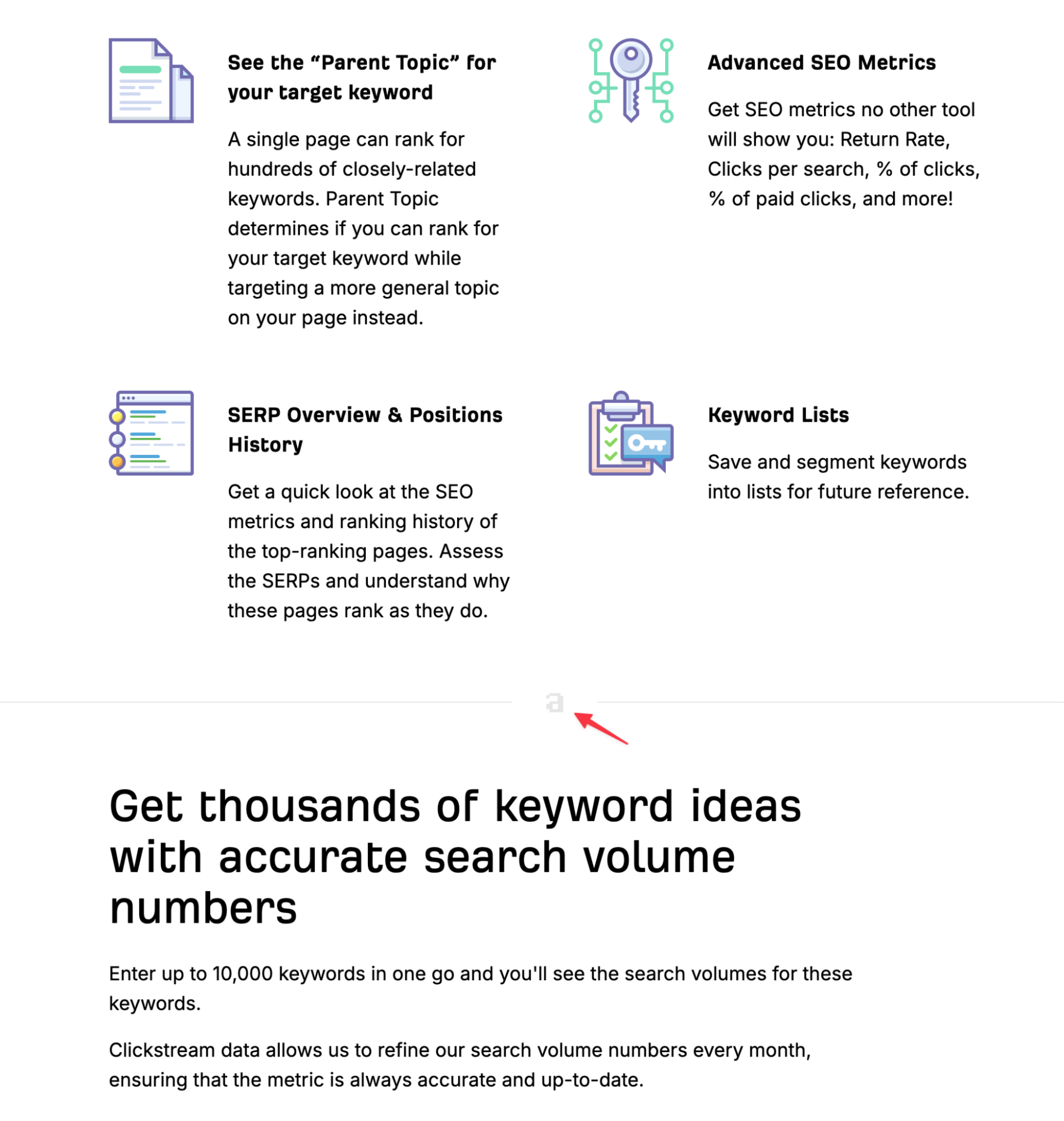
You can customize high-converting landing pages without any professional design skills. For example, the SEO tool Ahrefs has landing pages tailored to each major function and use case.
The landing page design for the keyword research feature uses small graphics to break up key points into blocks of text. It also uses a clever way to reinforce brand consistency and logo recognition by inserting a small Ahrefs logo into the line breaks without having to include the full version.
Tabs
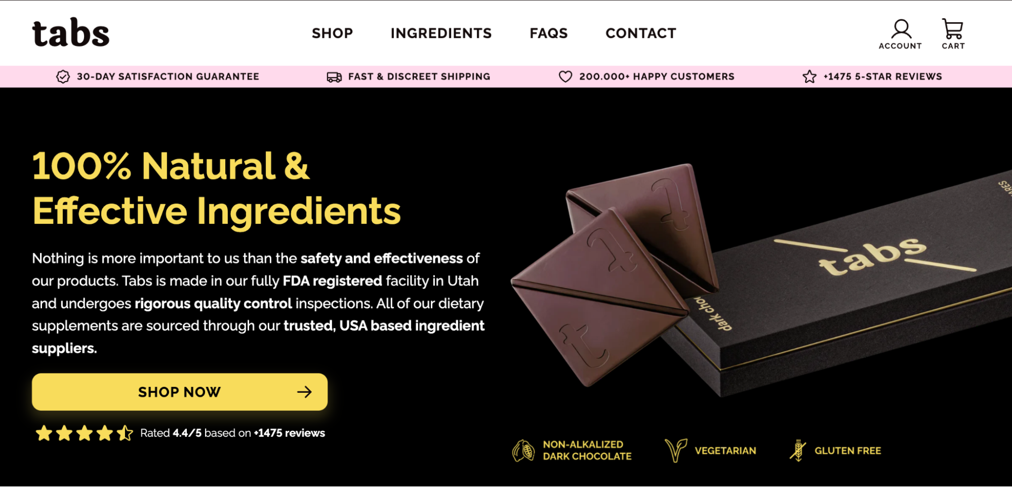
Tabs ’s Material page is a masterclass in how to integrate social proof into your landing page design. The page features a pink notification bar that contrasts with the monochrome design, showcasing a money-back guarantee, thousands of 5-star reviews, and over 200,000 satisfied customers.
Additionally, there is a 5-star review section below the main CTA button, emphasizing that customers who purchase their chocolates are among their fellow customers. This location is strategically placed, as it is probably the last thing a user sees before clicking the CTA button.
Peepers
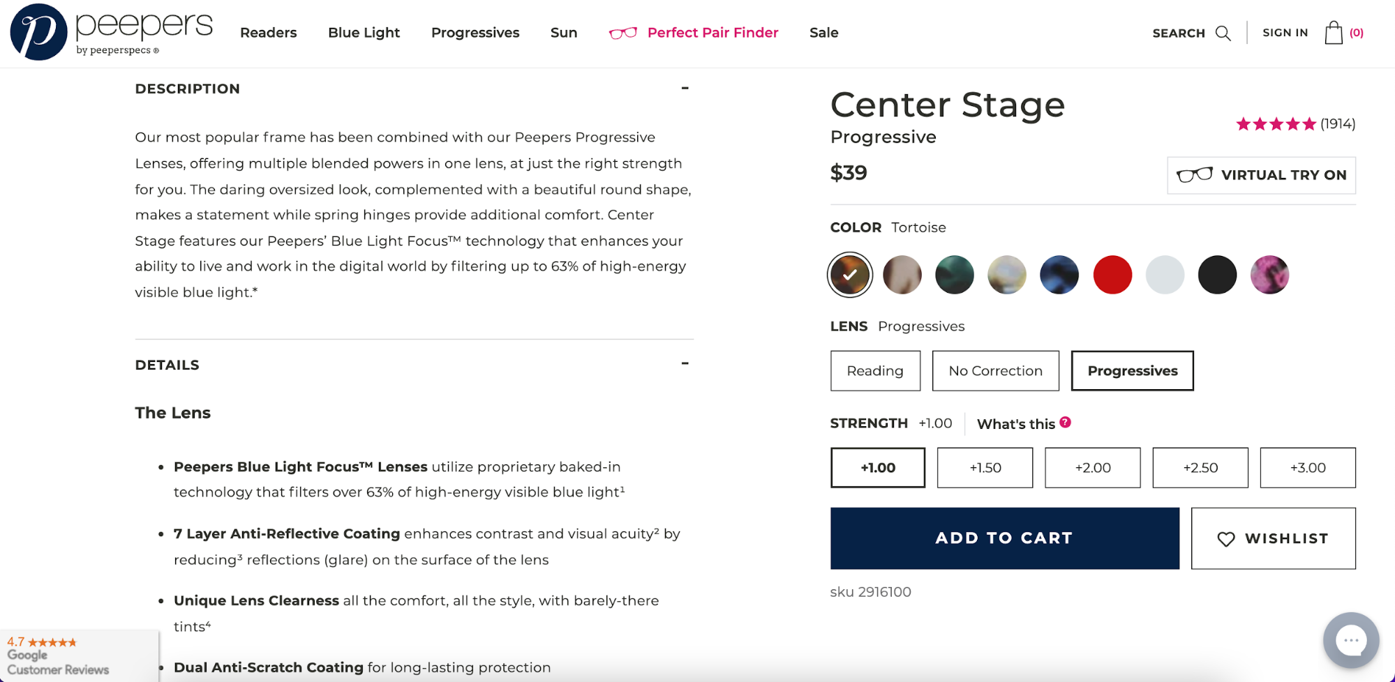
A product description that you can use in your landing page design is a concise statement that immediately conveys what the product is. There is more space further down the page to provide details that directly address any objections that may be preventing the customer from completing a purchase.
Eyewear brand Peepers uses this strategy: Above the fold are images of various products, and below are details and descriptions listing all the benefits of choosing Peepers lenses.
ConvertKit
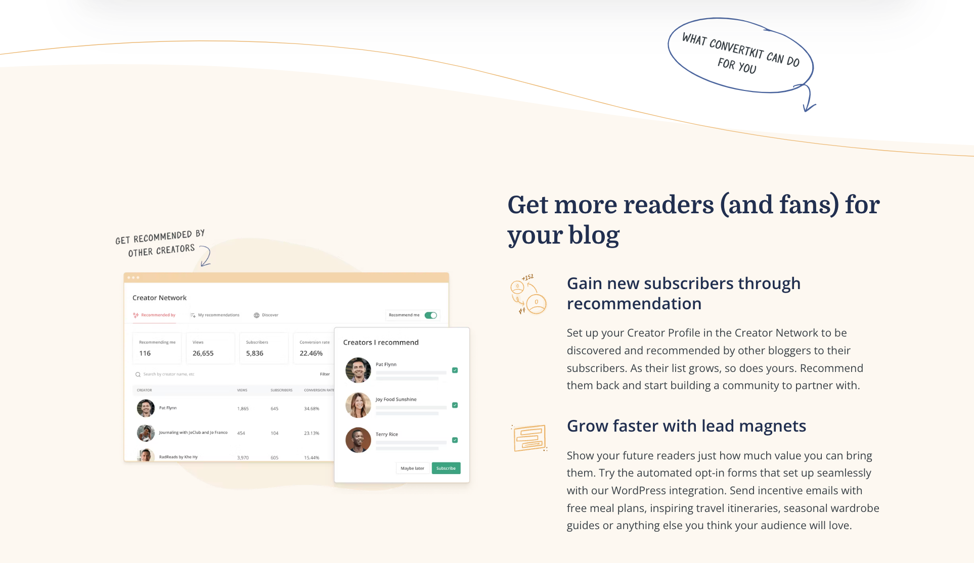
While it's generally best to use a few complementary colors on your landing pages, ConvertKit shows how you can use hues and shades to create variation without straying too far from your style guide.
What’s particularly notable about this landing page design is the use of white space. Instead of leaving the space above the subheading blank, ConvertKit’s designers added a handwritten note to the visitor. This is a smart approach that shows the subtle use of text and design inspiration, helping landing page visitors feel the brand’s personality.
Jones Road Beauty
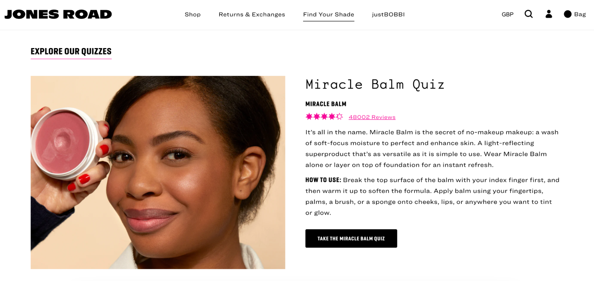
Some beauty brands have trouble with returns when selling cosmetics online, because the colors you see on your computer screen can look different than they do in real life. Jones Road Beauty solves this problem with a quiz that helps people find the right color for them.
Jones Road Beauty’s quiz landing page design is simple and intuitive. It may seem to go against the best practice of only including one CTA, but it does a good job of explaining what quizzes are available, how to use them, and how to take the quiz. There’s also a small star rating under the quiz subheading, highlighting how the quiz solves the color mismatch issue.
BEAM Content
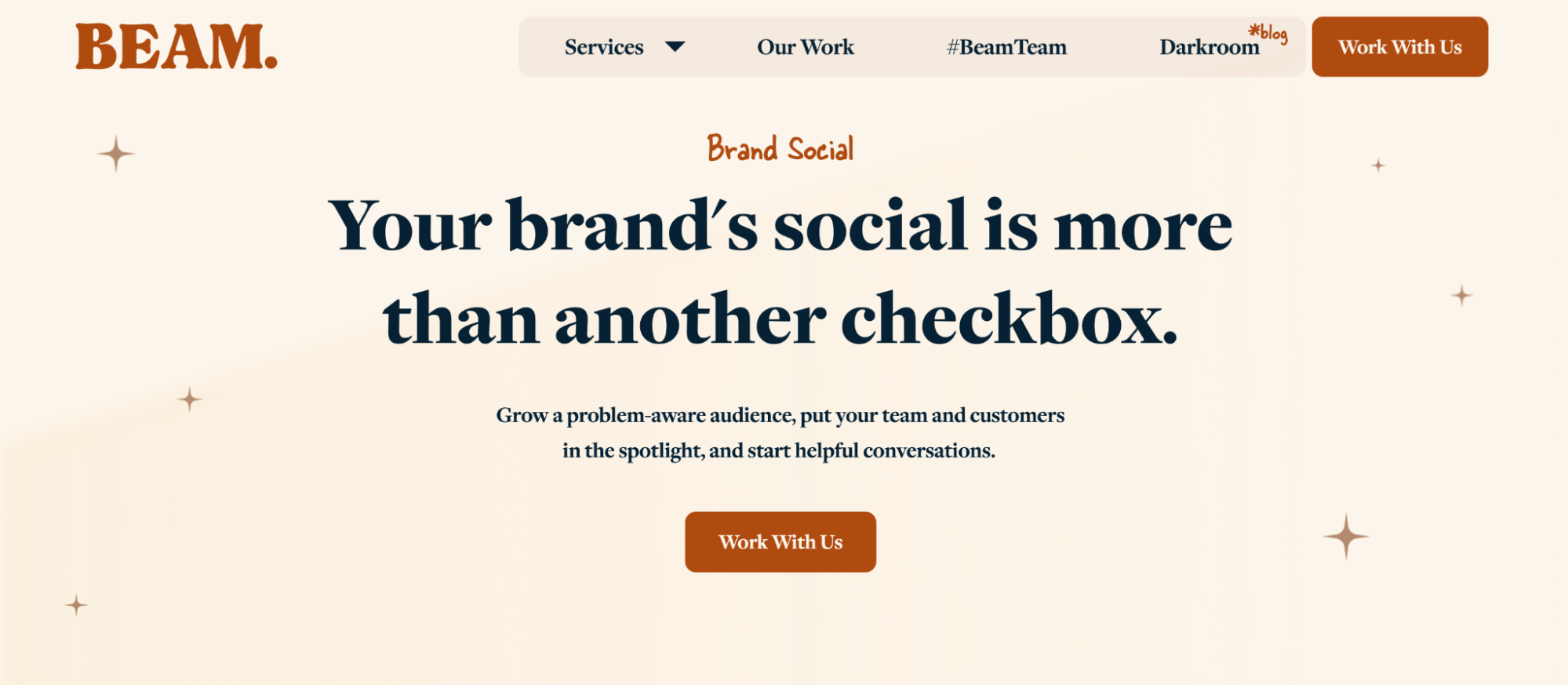
Just as your copy needs to fit your brand, so should your images, fonts, and colors. While you can take a more creative approach to landing page design, it’s important to provide a consistent brand experience across all touchpoints.
BEAM Content is a great example of a landing page for inspiration. The agency uses a sophisticated color palette and uses graphic elements that match. The font selection is simple and elegant, with a hand-drawn font that draws attention to important copy. For example, they use this font for their main service offerings, such as “Brand Social.”
Basecamp
Customer testimonials are a key element of landing page design. One study found that displaying reviews of high-value products on a page can increase conversion rates by up to 380% .
The problem with customer testimonials, however, is that you can’t arbitrarily change the content. It’s bad practice to paraphrase someone else’s words and make them your own. However, Basecamp shows you how to make your testimonials stand out by highlighting the strongest parts of the testimonial.

Maev
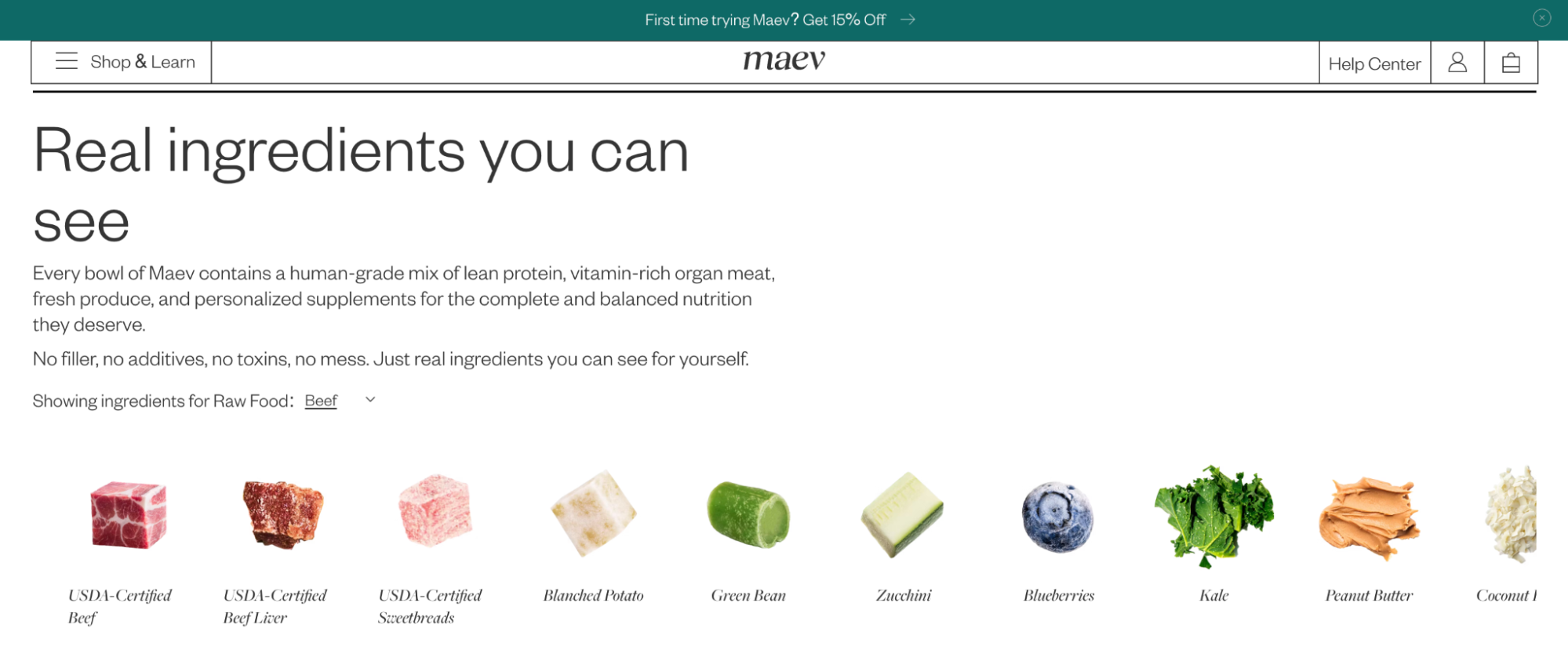
Maev is a great landing page example to reference when you need to present a lot of information in a visually appealing way.
Instead of simply listing the ingredients in her dog food, Maev uses images. People can immediately recognize ingredients like blueberries and kale, making it easier to visualize what your dog is eating, a common problem when shopping for pet food online.
Money with Katie
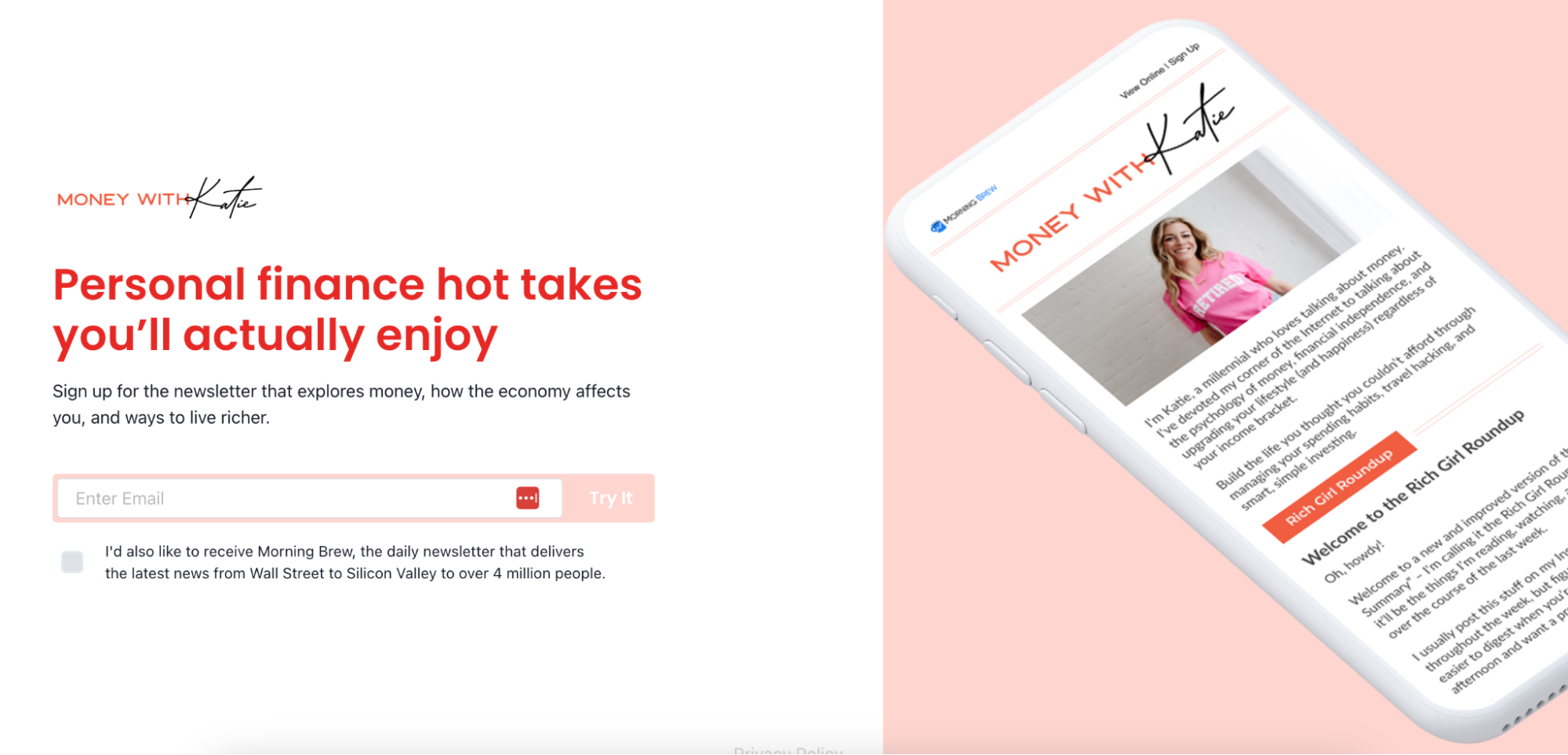
The goal of a newsletter landing page is clear: get someone to sign up for your email list. Morning Brew’s newsletter, Money with Katie , does this perfectly without investing in a full-length landing page design.
Money with Katie’s landing page is all that’s visible “above the fold” when you first log in. There’s no scrolling required, and it doesn’t overwhelm visitors with too much information. The headline promises exactly what they’ll get, and the photo shows what they’re signing up for. All the user has to do is fill out the sign-up form.
Creator Wizard
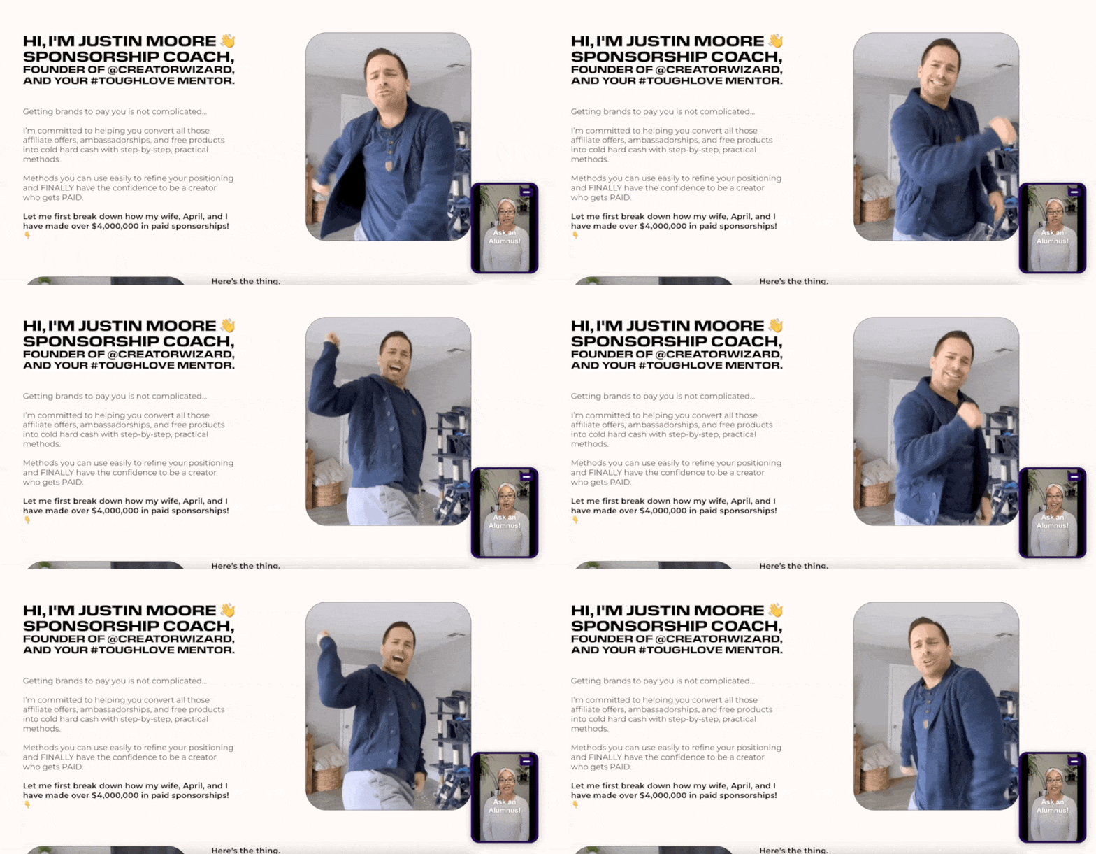
Justin Moore is a sponsorship coach who sells digital products. Gifted to Paid is a premium online course that teaches creators how to close sponsorship deals and monetize their online content.
Gifted to Paid addresses these goals throughout the landing page. In particular, this section provides visitors with information about the course’s tutorials. There’s a lot of information to digest, so Justin made some smart design choices to make it easier to understand, such as bolding important text and using GIFs.
Description
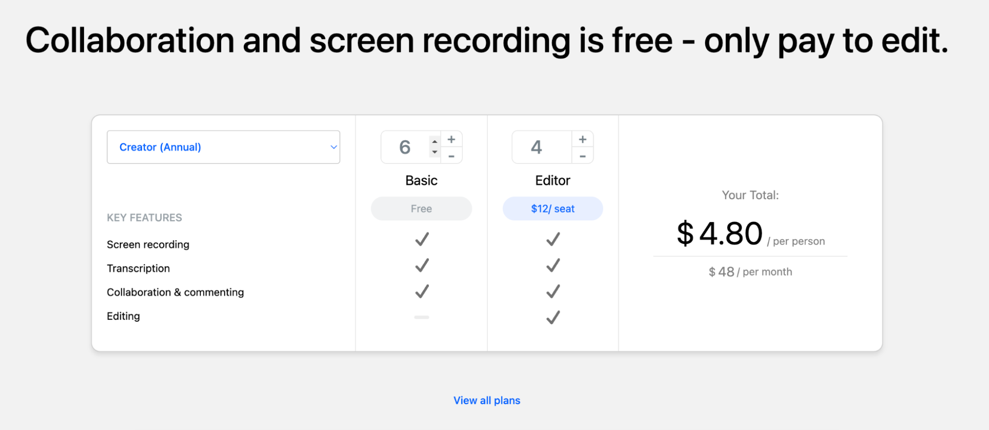
Headlines take up the most space on a landing page and are an important element to design. For example, Descript ’s landing page cleverly addresses the obstacles visitors might have before converting by using a headline: “How much does it cost?” and “What’s actually included in the ‘free’ plan?”
Because there are so many pricing variables, we also provide an interactive price calculator to help people easily understand the cost of video editing software. This is much more engaging than static content and helps brands personalize at scale.
Shopify POS
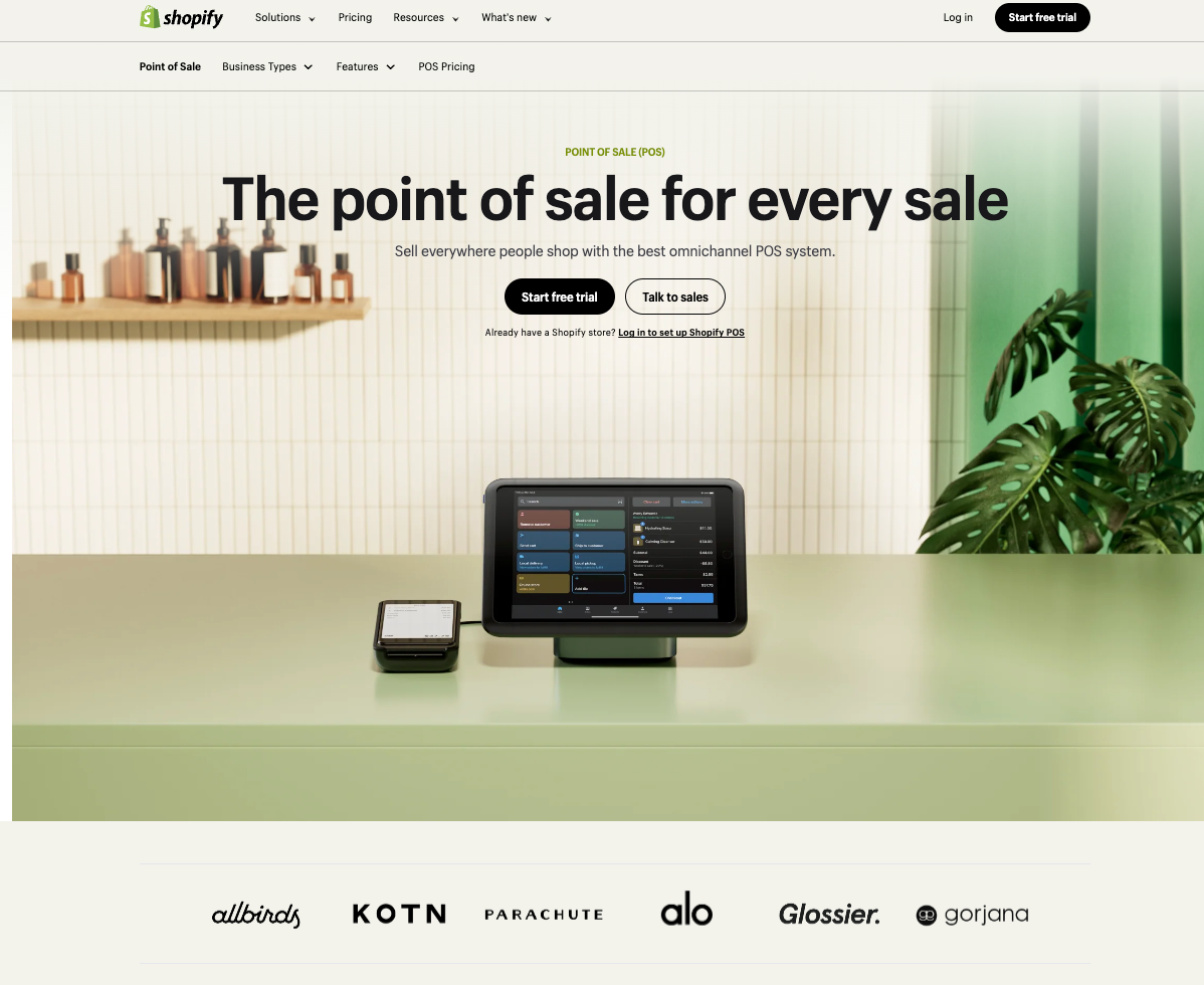
Designers who designed Shopify’s point-of-sale (POS) landing page had the difficult task of satisfying three different calls-to-action (CTAs):
- Start your free trial
- Talk to our sales team
- existing Log in to your Shopify POS account
Button color makes a big difference here. High-contrast buttons (white text on a dark background) stand out the most in a neutral design, so they’re used for the most important CTA: the “Start your new experience” option.
The 'Contact Sales' button uses a reversed color in a button box of the same size. The third, less important option is displayed as a small text link below each button.
Landing Page Design Best Practices
Now that you’ve captured your potential customer’s attention, you have just a few seconds to communicate what makes your brand and product special. This is no easy feat, especially when your potential customer knows little about your brand.
Performance will vary depending on many factors, but keeping your overall landing page design simple will help you effectively convey the information that people need to see most. If there’s one thing you want your customers to remember when they leave your page, what is it?
Consider the flow of information
Whatever works best for your customers, you should think carefully about what kind of copy and content you place at the top of your landing page. However, trying to put all your content on the first screen can create a confusing experience for your users.
“Marketers need to think less about ‘above the fold’ and more about the overall information hierarchy and content flow on their landing pages,” says CRO consultant Michael Aagaard .
When building a landing page, consider the following questions. The answers will depend on your understanding of your target customer’s overall user journey and the role your landing page is intended to play.
- Are you answering the right questions and tackling the right barriers?
- Are you managing the 'promises' presented by your advertising sources?
- Are you delivering your content in the right order and building momentum toward your conversion goals?
Optimize your buy box to increase conversion rates
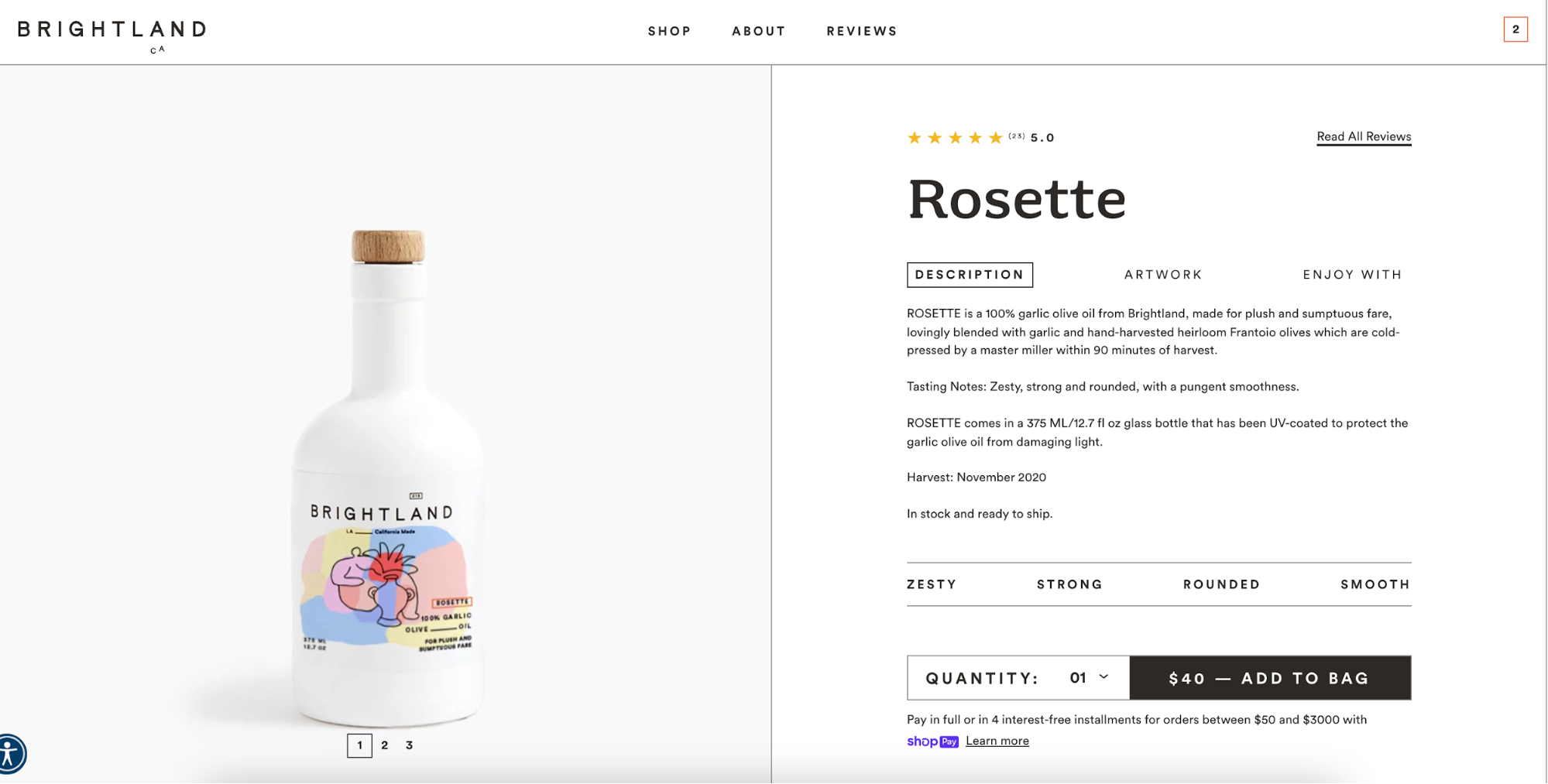
The Buy Box is a small part of each landing page that should have a big impact. Ezra calls it the most important part of a product landing page. The Buy Box is an actual box on the page that contains highly optimized conversion assets, including a Buy Button.
Typically viewed on desktop, a buy box includes a carousel of product images on the left, a summary on the right, sales copy, price, review ratings, a Buy button or Shop Pay button, and a unique selling proposition below the button.
“Most companies don’t have sales copy in their buy box, they don’t have social proof in their box, they don’t have a unique selling proposition and image format under their ‘Add to Cart’ button, and their product carousels have ugly images,” says Ezra. “The buy box is everything.”
There are a few template elements that give you space to make your copy and images stand out. A highly optimized buy box includes what Ezra calls “conversion asset stacking.” Here’s an example on desktop:
Focus on the visual elements
When considering whether to complete a desired action, the image of the product may be the only information a potential buyer can rely on. Make your landing page design more visually appealing by breaking up the information into different elements:
- Bullet points or numbered list
- Logo or graphic
- image
- CTA Button
- review
- Video Recommendations
In e-commerce, images are a way for buyers to imagine a product without actually being able to touch it. If the photo doesn’t fully capture the appeal of the product, it’s hard for customers to fully appreciate its appeal.
Use responsive design
You’re likely designing your landing page for a laptop or computer screen, but in reality, not all users access your landing page from a desktop. Nearly half of all internet traffic comes from mobile devices. Responsive design allows your landing page to adapt flexibly to fit any device.
Use a website builder to see how your image carousels and CTAs render on both desktop and mobile, so you can keep them optimized. Other tips for responsive website design include:
- Use the collapsible menu
- Detailed and seamless experience
- Reduce image size by using an image compressor like TinyPNG to speed up loading time
- Avoid autoplay videos
- Use large, finger-friendly buttons
Traffic and device source analysis
Designing your landing pages based on the device your customers are shopping on is a great way to start your conversion research.
If most of your customers visit your website via mobile devices, you should optimize your landing page for the mobile experience. On the other hand, if you know that your customers prefer desktops, it would be better to build a landing page that enhances the desktop experience.
Nik Sharma of Sharma Brands recommends analyzing your traffic to get a deeper understanding of where people are coming from—TikTok, Facebook, blog posts, or other channels.
“If you don’t properly tailor your pages to the platform the user is coming from, you’ll see a spike in bounce rates and a low overall platform ROAS (return on ad spend),” he says. This contextual listening improves the overall customer experience.
Test your landing page design
Once your landing page is live and you start seeing meaningful traffic to your site, you can A/B test different elements of your landing page design to ensure the highest possible conversion rate.
A/B testing isn’t just about finding the best performing tagline or call-to-action placement. “Testing shouldn’t be about proving an opinion, but about challenging a strategy or validating a hypothesis that’s directly tied to a customer problem or business opportunity,” explains Ben Labay, managing director at Speero by CXL .
Ben says that your testing should be directly proportional to the factors that are related to your business growth model. If you want to acquire more customers, monetize Instagram, or retain existing customers, your landing page experience and testing hypothesis should change accordingly.
Understanding When Landing Page Design Best Practices Fail
The landing page design tips presented in this article are proven and proven success stories from experts. However, before you blindly implement these design elements, it is important to understand how they connect to your overall goals.
To build a landing page with a high conversion rate, it is essential to understand the needs of your target customers.
“The better you understand your target audience, the better your landing pages will be,” Michael advises. “Don’t get caught up in the latest design trends.” “Instead, get all the basics right and do some deep user research to make informed decisions that influence behavior, not just change the layout of your page.”
Build a beautiful landing page design
Shopify provides all the tools, apps, integrations, and themes you need to get started designing your landing page. Start from scratch or use a template, customize it to fit your brand, and manage everything from anywhere.
Also thousands of Explore Shopify apps and add landing page features and functionality to increase conversions and maximize your investment.
Landing Page Design FAQs
What is Landing Page Design?
How do I create a landing page?
- Choose a platform like Shopify to create your landing page.
- Design your page with a headline, call-to-action (CTA), and other necessary elements.
- Use effective headlines. Headlines should be concise and catchy.
- Add content to your pages, such as images, videos, and customer reviews.
- Use keywords and other SEO best practices to ensure your landing page is found by search engines.
- Test your landing page and make adjustments based on the results.
