How to increase sales through payment completion pages

The moment before a purchase is exciting and full of anticipation. Customers spend time and effort researching the right product, and when they make a purchase decision, they anticipate how the product will improve their lives. And so the moment of truth arrives: when they click the “buy” button. But what happens after the purchase? The customer journey Including an order completion page can help maintain customer excitement and anticipation even after the transaction is complete.
What is an order completion page?
An order completion page is a web page that appears immediately after a user performs a desired action. The order completion page doesn’t just appear after a purchase. It can appear after almost any action, such as registering for an event, creating an account, or filling out a form. The order completion page is your opportunity to confirm the user's action, thank them, and provide additional information.
The order completion page is a small gesture that can have a big impact. It is an opportunity to express your gratitude, and it can introduce another communication point that increases conversions, improves customer retention, and deepens the relationship with your customers. In addition, The order completion page is also an opportunity to sell additional products and encourage visitors to stay in the sales funnel.
Elements to include on your order completion page
- Thank you note
- Confirmation message
- Next Step Guide
- Social Links
- Customer Reviews
- Related Content
- Incentives provided
The order completion page can accomplish several goals, including confirming the transaction and guiding the customer to relevant content. Therefore, the messaging you use can vary depending on where they are in the customer journey. The most effective When creating your order completion page, consider the following elements:
Thank you note
A simple “thank you” makes customers feel valued. Express your gratitude before asking them to do anything else.
Order confirmation message
An order completion page typically appears immediately after a web visitor has completed an action. For example, when a customer purchases a product, it clearly indicates that the transaction has been completed successfully.
Next Step Guide
Let your users know what to expect in the future. If they’ve purchased your product or registered for a webinar, tell them where to find more information. Provide a clear explanation of how you’ll deliver all your assets.
For example, if a customer purchases a PDF download, You can include a download link on your order completion page. Many The order completion page includes a message directing the user to their email inbox for additional information.
Social Links
Provide links to keep your customers engaged through your social media accounts. You can also include social sharing buttons to encourage users to share their experiences.
Customer Reviews
Including social proof, such as customer reviews or links to user-generated content, can help give consumers confidence that they’ve made the right decision.
Related Content
Providing additional resources can help keep customers on your website longer. For example, if you sell homemade vanilla bean paste, you could include images of baked goods and links to recipes using your product on your post-purchase confirmation page.
Incentives provided
Offering incentives can help you grab customers’ attention and encourage them to take further action. Some checkout pages offer discounts on future purchases or encourage them to reward you for making a referral.
Types of order completion pages
- Create an account
- Make a reservation or register for an event
- Confirm Purchase
- Subscribe
One of the goals of a checkout page is to keep users engaged after they’ve taken the desired action. These dedicated pages can appear at the right time and offer additional actions that lead to the next step in the sales funnel, helping you convert new prospects into paying customers.
Next is This is a situation where an order completion page is required:
Create an account
The confirmation page is the first screen a new user sees after creating an account. This page is a great opportunity to thank them for creating an account, as well as show them what they can expect from your platform, including links to customer reviews or product tutorials.
Make a reservation or register for an event
After completing the webinar application or reservation, You can provide additional information through the order completion page. You can provide more information about the event or encourage users to share their attendance on social media. You can also remind users to add the event to their personal schedule management tool or Google Calendar.
Confirm Purchase
After the customer completes the purchase, The order confirmation page is a great way to thank the customer and confirm that the transaction was successful. Many businesses also use this opportunity to offer upsells or cross-sells to increase sales. For example, if a customer has purchased a new set of golf clubs, you can promote a new golf ball on the purchase confirmation page while thanking the customer.
Subscribe
For new subscribers The order completion page is an opportunity to suggest additional actions. After signing up for your email newsletter, you can encourage your prospect to make additional purchases, invite friends, or attend an event.
Example of order completion page
Here's an example of an order completion page that includes a Shopify store owner:
Heroine Sport

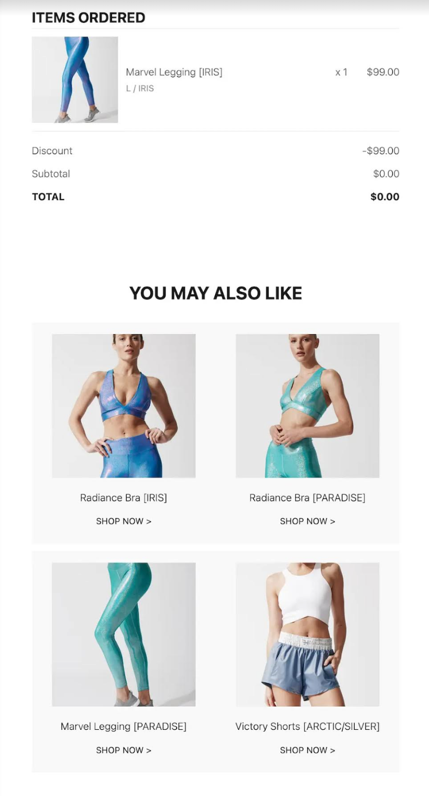
Heroine Sport, which uses Shopify, provides a great example of cross-selling. We have an order completion page. After the user purchases the leggings set, Heroine Sport Promote additional products in the same line through the order completion page. This is an effort to drive sales by targeting products that suit the customer's tastes.
True Classic

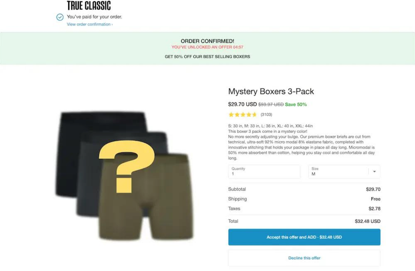
Shopify seller True Classic shows an example of leveraging upsells on their confirmation page. On this page, True Classic first confirms that the order has been successfully completed, and then offers a limited-time 50% discount on the Mystery Boxer set.
Warby Parker

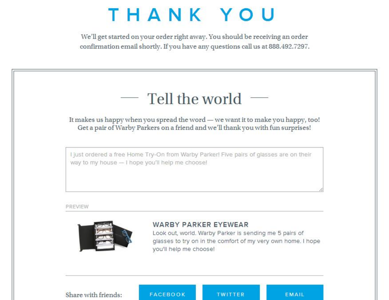
After purchasing from Warby Parker The order completion page starts with a short thank you message. It includes clear text that tells the customer what to expect next and that an order confirmation email will be sent. The page also includes a strong call to action (CTA) that encourages visitors to share their purchase on social media.
Order Completion Page FAQ
What is the difference between an order completion page and a landing page?
Marketing materials such as emails and digital ads typically link to landing pages designed to elicit specific user responses. The order completion page appears at the end of the conversion process after the user has performed the desired action.
Does the order completion page affect SEO?
Your order completion page shouldn't have a significant impact on your site's search performance. If you don't want your order completion page to appear in search results, you can set the page to "no index."
Should I include social media links on my order confirmation page?
yes. Including social icons or links on your order confirmation page gives visitors a way to learn more about your company and stay connected.
Do you need to track analytics on your order completion page?
Yes. Tracking metrics like link clicks and time on page can help you identify areas for improvement and optimize your page design.
